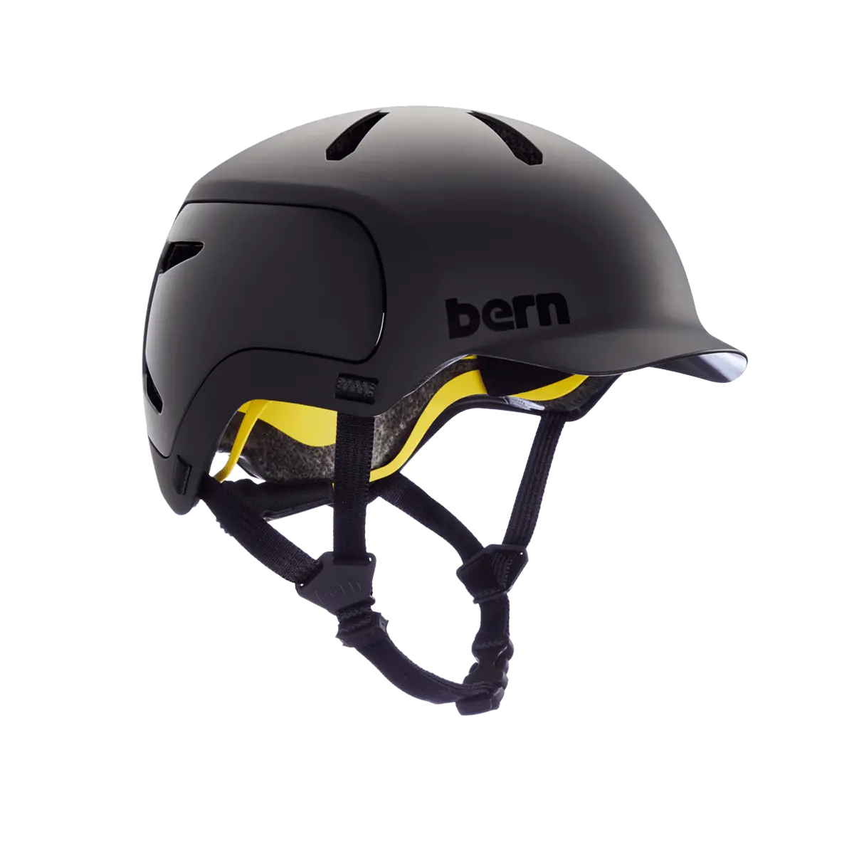
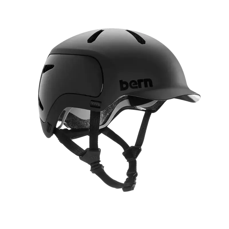
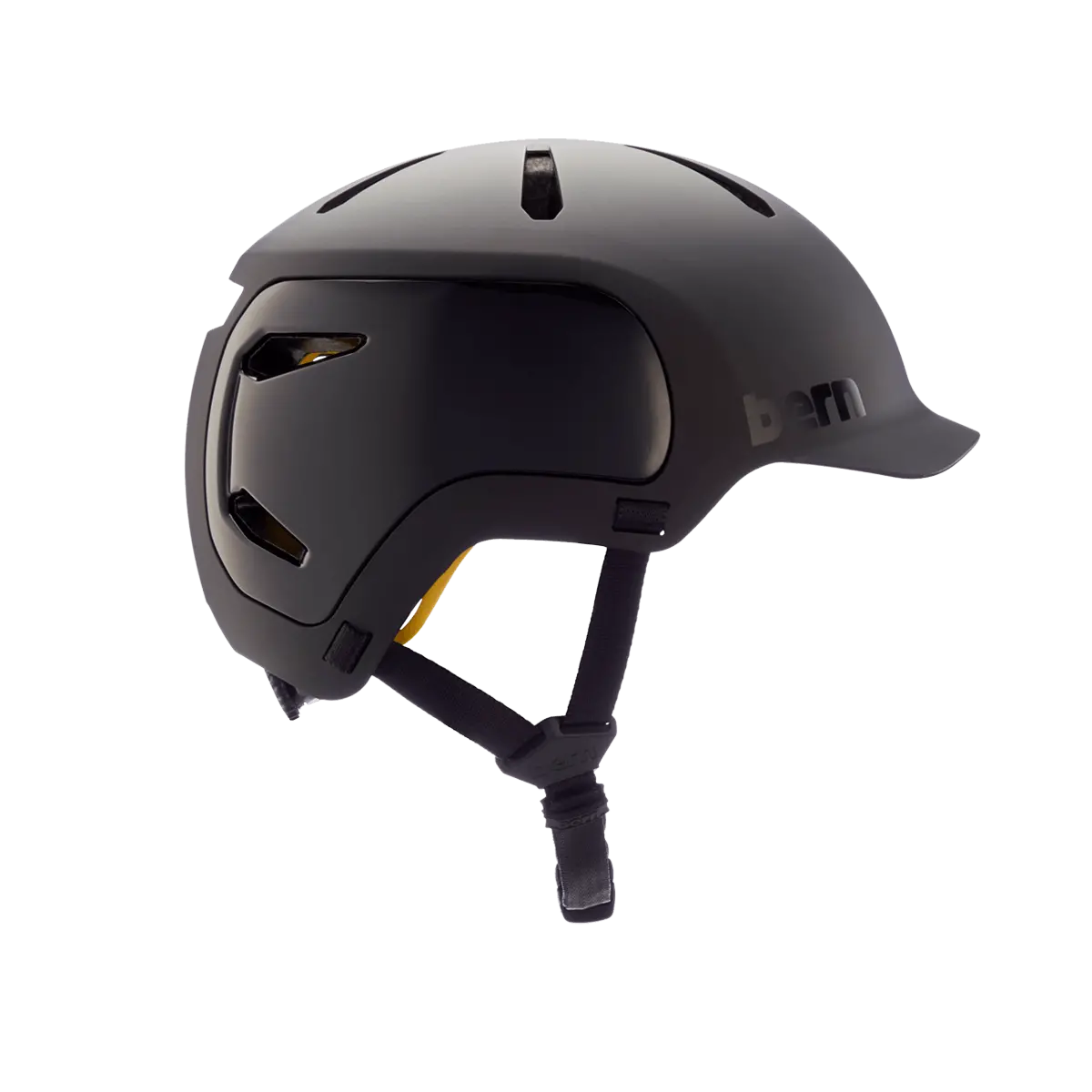
Description
/* RTE style begin */.rich ol, .rich ul { margin-top: 0px; margin-bottom: 0px;} .rich .imgbrdr { border: solid 1px; } .richIcon { display: inline-block; background-image: url(Images/sprite_main5.png); background-repeat: no-repeat; width: 15px; } .richAttach { background-position: -2px -122px; } .richImg { background-position: -2px -1120px; } .richScreen { background-position: -24px -1032px; } .richArticle { background-position: -24px -1054px; } /* Correct box */ .rich .GrayBox { border: solid 1px #CCCCCC; background-color: #F9F9F9; padding: 4px; /*margin: 4px;*/ width: 98%; } .rich .hintcell { height: 36px; width: 32px; vertical-align: middle; } .rich .warncell { height: 36px; width: 32px; vertical-align: middle; } .rich .boxcontent{ width: 100% } .rich pre { font-size:1.3em } .rich iframe{ border: none; } .rich iframe.iframeBorder, .rich img.iframeBorder { border: solid black 1px; } .rtetable > tbody > tr > td, .rtetable > tr > td { white-space: nowrap } .rtetable > tbody > tr:first-child > td, .rtetable > tr:first-child > td { background-color: silver } .rich pre.source-highlighted {background-color: #F0F0FF;} .rich pre.source-highlighted .nu, .rich .sourcetable .nu { color: brown; } .rich pre.source-highlighted .kw, .rich .sourcetable .kw { color: blue; } .rich pre.source-highlighted .cmt, .rich .sourcetable .cmt { color: green; } .rich pre.source-highlighted .sl, .rich .sourcetable .sl { color: brown; } .rich pre.source-highlighted .br, .rich .sourcetable .br {color: darkgreen; } .rich pre.source-highlighted .add, .rich .sourcetable .add { background: palegreen; } .rich pre.source-highlighted .del, .rich .sourcetable .del { background: pink; } .rich table, .rich tr, .rich td, .rich img, .rich iframe { cursor: default; } .layout .rtecell { vertical-align: top; font-size: small; } .rtetable > tbody > tr > td, .rtetable > tr > td { vertical-align: top; } .rich p{ margin:0px 5px 0px 0px; } .rich .align-center{ text-align: center; } .rich .align-right{ text-align: right; } .rich .align-left{ text-align: left; } .rich li[style*=’text-align: center’], .rich li[style*=’text-align: right’] { list-style-position: inside; } .rtetable { empty-cells: show; border: solid 1px black; border-collapse:collapse; } .rtetable > tbody > tr > td, .rtetable > tr > td { border: solid 1px black; height: 1.5em; min-width: 20px; padding: 0px 5px } .rich table {font-family: arial; font-size: small} .rich blockquote.shift { margin-right: 0px;margin-top: 0px; margin-bottom: 0px; } .rich img[data-expand] { display: block; } .rich p, .rich p.richp {font-family: arial; font-size: small} .rich blockquote.shift h1, .rich blockquote.shift h2, .rich blockquote.shift h3, .rich blockquote.shift h4, .rich blockquote.shift h5, .rich blockquote.shift h6 { margin-top: 0px; } .rich, .rich * { word-wrap: break-word; } .sourcetable {background-color: #F0F0FF; font-family: monospace; width: 100%} .sourcetable tr { margin: 0px; padding: 0px; } .sourcetable td { margin: 0px; padding: 0px; white-space: nowrap; } .sourcetable > tbody > tr > td:first-child, .sourcetable > tr > td:first-child { width:1px; } .filelist { /*display:inline-block;*/ padding: 5px; } .rich .toc { /*display:inline-block;*/ padding: 5px; } .rich .toc .header,.rich .wikilist .header,.rich .filelist .header { font-size: 1.7em; } .rich .toc li,.rich .filelist li { margin: 5px 0px; } .rich .wikilist div { margin: 10px; } .rich .layout {min-height: 2.5em; display:table; width:100%; border-spacing:5px; table-layout:fixed; empty-cells: show;} .rich .layout .rtecell {display:table-cell; height: 2.5em} .rich .layout .rteside {width: 25%} /* .rtetable { border-collapse:collapse; } .rtetable > tbody > tr > td, .rtetable > tr > td { border: 1px solid #ddd; padding: 7px 10px; vertical-align: top; text-align: left; }*/ .rich blockquote.realbq { border-left-color: lightblue; border-left-width: 1px; border-left-style: solid; margin-top: 0px; margin-bottom: 0px; padding-left: 5px; } .rich body {font-family: arial; font-size: small} .rich .GrayBox { margin-left: 8px; } .rich .sourcetable { font-size:1.3em;} /* RTE style end */The Watts 2.0 is your jack-of-all-trades adventure helmet, purpose built for all season shredding. We took the original Watts helmet, put it on a diet, added more airflow, and dialed it in with a Compass Fit system that makes it easy to get a custom fit in seconds. This lid features that signature Bern brim in a shell that’s 20% lighter than the original, providing you with the ultimate balance of style and comfort. Swap in a summer or winter liner and you’re set to stay out there for any outdoor pursuit.
Features
ALL SEASON
Pick the model that best fits your style and customize your helmet with our range of seasonal upgrades.
COMPASS FIT
Find your perfect fit with our compass fit system. Simply twist the dial to adjust to your custom fit, keeping your head snug and secure. Due to its light weight, this system will feel as if the helmet were custom made for your comfort.
INTEGRATED LIGHT
Bern’s custom-integrated LED light is lightweight and easy to use. This light brings ~6.6 lumens, micro-USB rechargeable, lasts up to 10 hours, water resistance, and has three light settings (steady, flash, and pulse). Simply click in place and ride on. Clickmount light included with Hudson model and sold separately for the Watts 2.0
Specs
| Avg. Weight | 350 Grams |
| Safety Standards |
|
| Construction | DSI |
| Fit System | Compass Fit |
| Vents | 11 |
Size Chart
| Fit Size | S | M | L |
|---|---|---|---|
| CM | 52 – 55.5cm | 55.5 – 59cm | 59 – 62cm |
Explore more from our collection.
Reviews
There are no reviews yet.